
1. How to make your photos look professional!
I'll show you how to maintain the quality of your pictures from shooting till
uploading online my way!
2. Cleaning as fast as you can!
I'll show you how to clean up in less than 5 minutes and do things, little things
faster and quicker.
3. How to use a Glidercam like a pro
Hard to master but easy to learn. I will give you tips on how to use it.
4. How to live a college life
show you how to live the luxury life, the cheap life, the moderate life as a college student.
Thursday, September 15, 2011
4 Good websites and Analysis
1. Mc'Donalds Website
Mc'Donald's Webpage

My Analysis
1. Very good use of type. Size of type uses a hiearchy flow.
Typeface recognized here is
Rockwell.
2. Proper use of hiearchy
3. This website uses a properly arranged and designed gird system.
4. Good readability and Flow
5. Content is properly arranged nicely and categorised.
6. Good navigation design. “It was easy to browse through!”
7. Memorable Identity
2.The White House Website
The White House

My analysis
1. The type used in this website looks interesting. Like a newspaper. Many of them are Serif fonts.
2. Usage of Italic and Script fonts.
3. This website uses a properly arranged and designed gird system.
4. Good readability and Flow
5. Information packed but nicely placed in site.
6. Nicely categorised navigation.
7. Meaningful colors and of American theme.
3.Logitech's Website
Logitech Website

My analysis
1. Simple usage of type.
2. Minimal usage of text. Clean and simple.
3. Centered layout. Balanced.
“Everything in one page”
4. Enough content to get you to want to view more.
5. Special and simple way of categorising their products.
6. Very smooth and easy to access navigation links.
7. Choice of colors makes it unique and easy to remember.
4.BBC website
BBC Website

My analysis
1. Type used fits well with thier logo. Looks professional.
2. Bold text for categories
3. Using grid system. Site is properly arranged to show important news from top to bottom.
4. Short and informative. Fast read. Clear.
5. Categorized according to type of news.
6. Fast navigation. Minimal waste of time.
7. Elegent of professional Identity.
4 Photoshop/Illustrator tutorial goodies
Websites that have interesting tutorials
for photoshop and illustrator.
http://abduzeedo.com/
http://psd.tutsplus.com/
http://vector.tutsplus.com/
http://webdesignledger.com/
1.Photoshop tutorial, Video tutorial!
2.Another epic photoshop tutoria and still a video!!
3. Extremely hard tutorial but looks worth it.
Tutorial Link: http://psd.tutsplus.com/tutorials/icon-design/polaroid-camera-icon/
Final outcome of this tutorial

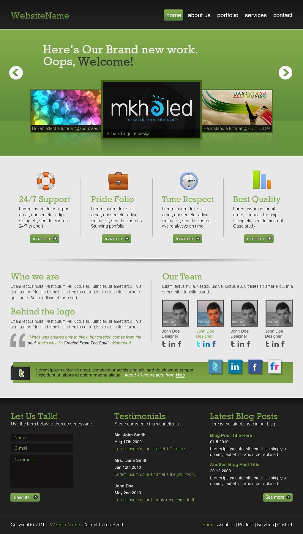
4. Webdesign 2.0 tutorial. Looks good.
Tutorial Link: http://psd.tutsplus.com/tutorials/interface-tutorials/create-a-professional-web-2-0-layout/

for photoshop and illustrator.
http://abduzeedo.com/
http://psd.tutsplus.com/
http://vector.tutsplus.com/
http://webdesignledger.com/
1.Photoshop tutorial, Video tutorial!
2.Another epic photoshop tutoria and still a video!!
3. Extremely hard tutorial but looks worth it.
Tutorial Link: http://psd.tutsplus.com/tutorials/icon-design/polaroid-camera-icon/
Final outcome of this tutorial
4. Webdesign 2.0 tutorial. Looks good.
Tutorial Link: http://psd.tutsplus.com/tutorials/interface-tutorials/create-a-professional-web-2-0-layout/
Subscribe to:
Posts (Atom)